They've been all over the place lately (just check out Pinterest for some amazing inspiration) for good reason. They're a really fresh way to display lots of pictures in one space, and can even aid in de-cluttering frames and pictures from table tops.
Typically, the flow of a gallery wall depends on how the room is used. A hallway calls for a more linear design, where as an entry or stagnant space like a kitchen banquet can handle more up and down movement.
In a place like an entry way, however, having a gallery wall that's totally symmetrical can be pretty delicious. Using pairs of pictures, and one mirror I found while at the thrift shop last week, I conceptualized the wall on the floor first (good idea if you're impulsive with the hammer)...
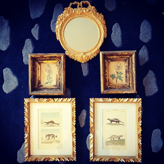
I have a heavy love for symmetry, so have a hard time gallery-walling without a central focal point anyway. Plus, I think they're much easier to arrange when you pick "a middle", so to speak.
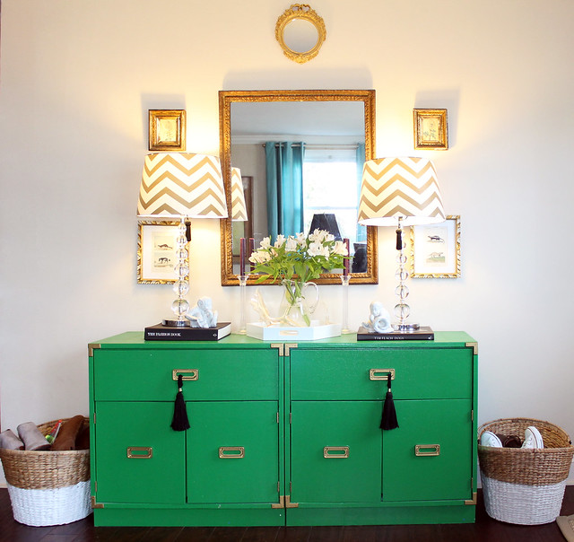
Gallery walls don't always have to be big or have tons of variety. This one only has four pictures and two mirrors all in the same color family.
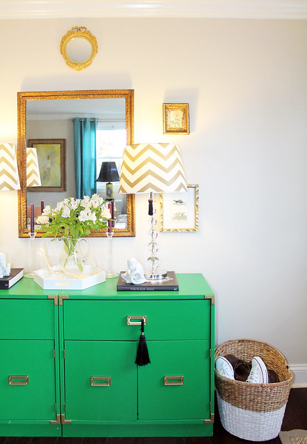
Mini gallery walls can warm up a space and make it feel lived in. They also add interest to a wall, even if they're on the smaller side.

Here is a FRIGHTENING before picture. Granted we had (sort of) just moved in.
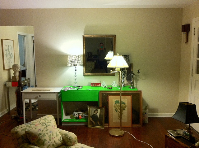
Another before shot.
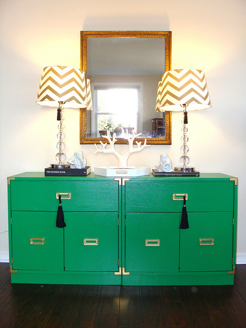
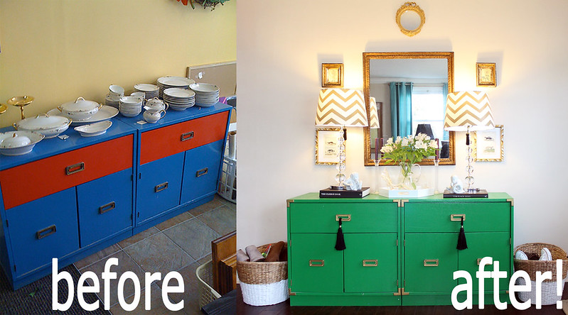
And the before and after fo real, fo real. This before is from the thrift store right after I talked the lady down to $35 for both. The after is how it looks today!

LOVE IT! It looks so great!!!
ReplyDeleteXO,
Krista
www.goodwillglam.com