
They literally look exactly the same in the paint can and on the swatch... which is why it's important to test ya colors.
 We're definitely going with Pink Harmony (left). Not too much red undertoneyness, and it's the perfect amount of pink without being overwhelming. I also like the way it plays off the fabric.
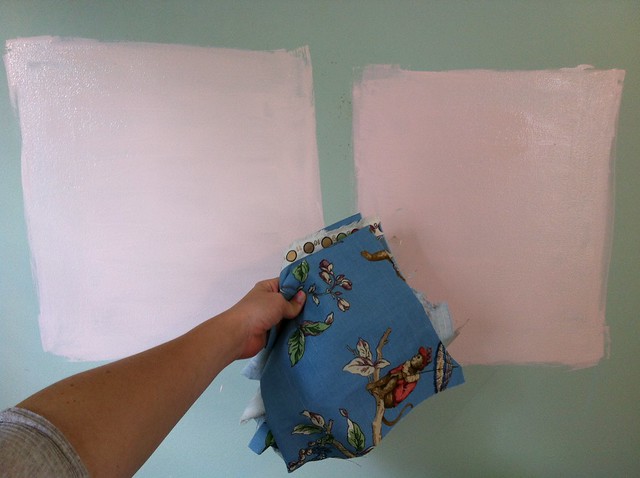
Things to consider when picking a paint:
- What are you painting over? is it light enough to use the paint and primer in one?... or not. The color we're painting over (Par Four Green by BM) is light enough to use the paint/primer in one... any darker we'd use an additional coat of primer.
- What's the texture of the wall? Darker colors will make a bumpy wall look like it has acne.
- Same deal with finish. Flat finish will mask bumps, but I'm not a fan of a flat finish. If I could do my whole house in high gloss I would. The thing about gloss is that it'll reflect light way more, so if you get enough light in the room it will end up actually masking imperfections. Buut... if you're in a dark room and do a high gloss it can look messy and not purposeful. Stick with semi-gloss or satin for most rooms and you'll be golden.
- Go with your gut: your gut is the best way to test if you're going to want to actually walk into this room every day. If your gut (and your husband) tell you not to paint a room red DON'T DO IT. More on that later.
No comments:
Post a Comment