Wednesday, April 2, 2014

Super cute small office

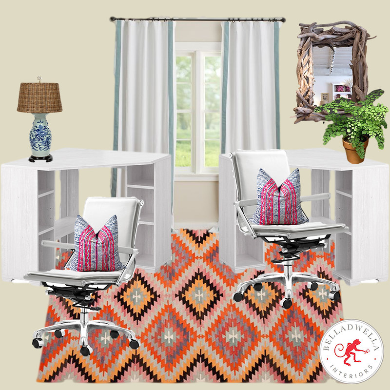
Just completed this e-design for a client that needed a two person office.

GrammieAndPapaOffice

I want one, too!
->>

Wednesday, March 12, 2014

Attic Progress

The attic space is coming along so well that I'm going to have to stop calling it the "attic" and start calling it the "2nd floor"...

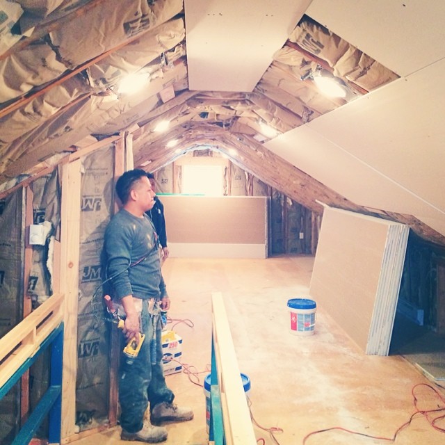
Our attic is 1,000 square feet of walkable space, and 1,800 square feet of ceiling, so it took about 4 weeks to complete the bare bones renovation (re-framing of the ceiling, new insulation, and drywall).

As you probably remember, here is the frightening before picture. ATTIC

You weren't able to stand up in the space as it was, so we had our guys remove the supporting cross beam from the roof, and raise it as high as they were able (about 2 1/2 feet, giving us 7 feet of head room). We then added supports lower down (so the roof doesn't collapse), which double as storage.
c50a5826878111e38dfc0e96a2f1168c_8

9ae56830806311e38c580e7be18a9944_8

We used regular insulation for the roof. We thought about spray foam insulation, but the ROI didn't kick in until 40 years from now... so we opted out. It's amazing how different out house feels with the new insulation. SO much warmer! We put in separate heating, and a separate electrical panel too.acd1aff29aff11e392900a27148c0424_8

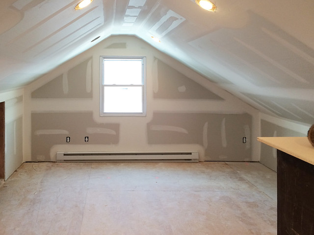
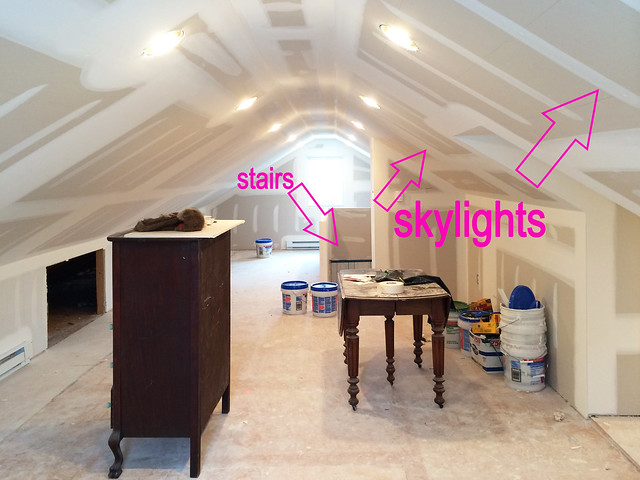
This is the 2nd floor today. I love how bright it is! The bed will go against that window eventually. And where I'm standing will be a play space/future bathroom.
photo 1

This is where the bed will go. C'mon house guests!!
photo 2

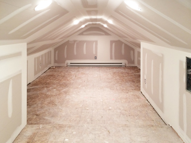
You know the coolest part about renovating this attic? Finding an extra 300 sq ft of walk in closet space. This area was so cluttered with crap that we deemed it unusable, but once they finished the framing we opted to add the lighting and the heat so we would use it as a huge closet.

We couldn't be luckier to have found this space, because people in the 1950's did NOT believe in closet space. 

I'm thinking lots of DIY built ins along the walls from Ikea, some fabulous wallpaper, and a cozy rug.
photo 3

In the spring we are adding skylights. They'll be above the bedroom area and look out onto our yard.
photo 4

After Trevor ripped up all the horsehair and 3 inch shag carpeting (ew) off of the stairs, we realized they are in perfect condition. Nothing fancy. They are your standard, boring, builder grade stairs, but with a coat of white paint and a fab runner they'll do just fine.
photo 5

Ok - That's all for now! Can't wait to update you with more 2nd floor progress in the future!

->>

Tuesday, March 11, 2014

Lightening up a dining room

Hello!

I've let the blog go by the wayside these past few weeks. I've been swamped with client projects and our house has been covered in drywall dust. The attic is finally ready for next steps, so I'll share some progress with you tomorrow.

This is a fun little project my client and I just completed. She wanted to lighten up her dining room area, and make everything work together in the space.

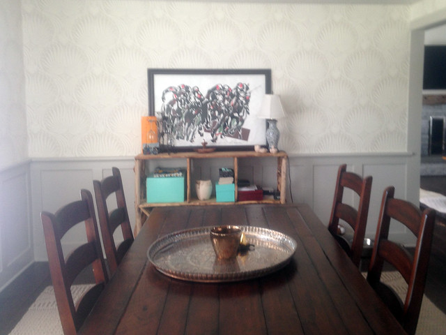
She has this adorable driftwood etagere, a dark wood plank table and chairs (which are on loan to her from a friend, but she has to make them work in the room), and amazing Farrow and Ball wallcovering. So much potential!
liz2

I suggested she lighten up the chair situation.

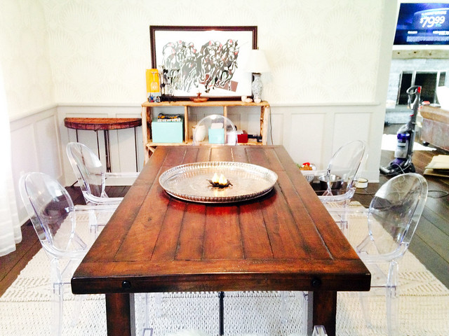
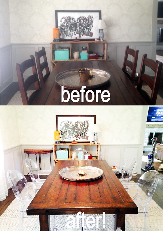
By using these Stark style ghost chairs in place of the wooden ones, the entire room is transformed. Once you remove the matchy matchy chair/table combo, you're eye is freed up to move about the space, notice the wallpaper, the rug, and the gorgeous table. 
Liz1

I just love how this turned out!!
BeforeafterLiz
->>

Tuesday, February 25, 2014

Candlesticks from Hattan Home

Hattan Home was kind enough to send me some of their candlesticks to decorate with.

In particular, we are talking about this adorableness.
23_grande

They arrived in the sweetest packaging, too. 000e2a1a999311e392c8123c34e343ec_8

I totally milked this opportunity to re-do a section of our home that hasn't "felt the love". Do you have sections of your home that you just ignore because they are too difficult to deal with? This was my section. But sometimes all you need is a lil motivation... in the form of candlesticks.

This picture is serr emberressen.
photo before

Once I received the candlesticks, I knew this was the direction I would go in. I quickly drove to one of my favorite consignment stores where I saw these beautiful gold leafed tole wall sconces about a month ago, praying the whole way that they would still be there.

They were STILL there. And I "had to buy them for this blog post".
140e6ac29bf311e3a42a12bd1ba02a9b_8

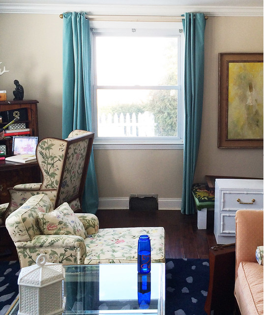
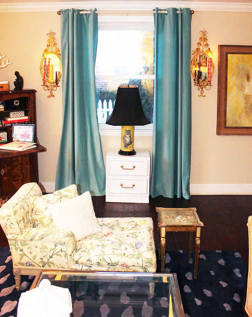
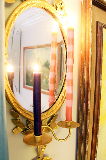
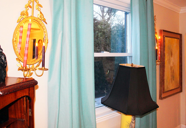
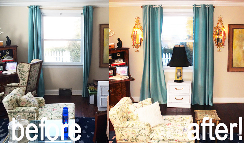
Here they are hung up on what once was this sad little wall. I love how the mirrors bring some depth to the vast expanse of wall. And the basic nature of the tole brings some texture to the wall. My Hattan Home candlesticks are so great looking in the room. They play perfectly off the pinks in my vintage chintz chaise.
2014-02-23 05.55.02

I love mixing candlesticks. It adds a bit of unexpected whimsy. 2014-02-23 05.57.18

I'm so glad to have fixed up this section of the room because it gets the prettiest evening light. 2014-02-23 05.55.26

2014-02-23 05.56.07

So happy with how this turned out! This is a great start to re-doing what will be our new entry and landing to the 2nd floor. Thank you Hattan Home! photobeforeafter

->>

Friday, February 21, 2014

A little vaycay.

This past week I was in Palm Beach. Here is what transpired.

Lulu and I matched.
c3399e76957d11e3b813127ca578ef71_8 - Copy - Copy

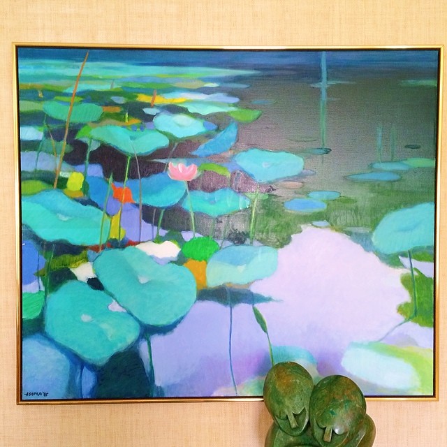
The house we stay in has the most beautiful art. ea889e6a95b811e3a0e20e2682207b63_8

35ce6ea896af11e3ba471297e0c187a3_8 - Copy - Copy

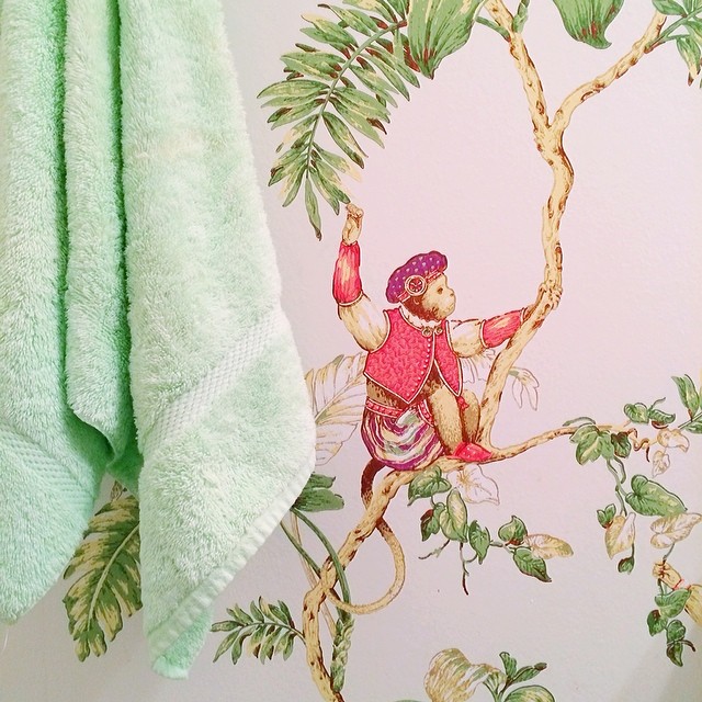
And wallcoverings.
6cacf15696aa11e3a36912172d8c639d_8 - Copy - Copy

I fell in love with a chair.
1eba478c974011e3971a0ab5eaa6645f_8 - Copy - Copy

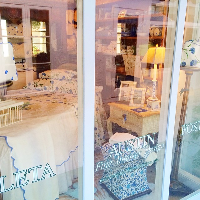
And admired my step grandmother's windows. They are putting a book out on her work in early 2015. Look out for it!
a968381c973b11e391d70a709678223e_8 - Copy - Copy

Ugh. Take me back!
5e5e390698c211e3aa4712dc2a2ca455_8 - Copy - Copy

->>

Friday, February 14, 2014

This week in insta:

Are you following along with @belladwella on insta? You should! It's fun I'm telling you.

Lulu mailed some valentines d22043fc92a011e396fc1239744ce7ef_8

I got some new headphones. And I might go back for the bigger ones because these aren't obnoxious enough. a5f213de942e11e385bd0e5ff6bec2c4_8

I found this amazing La Barge cartouche mirror at the thrift store for $60. 59e0e2428f6d11e3bba3127c7df452a8_8

And hung it here.
887610ca8f7f11e398f612f9a6a6a72b_8

We went on a fam date and got ice cream. I gave Lulu 5 bites of my snickers with hot fudge and she was up til 11PM. 2146bc40905811e3b6d41206ece04c86_8

I got the sweetest, sweetest valentine from my munchkin. 4b28c652951211e3abad122838c3d34d_8

Happy Valentines day!!
->>

Thursday, February 13, 2014

Ikea is rocking my world right now...

so I thought I'd share the items rocking it.

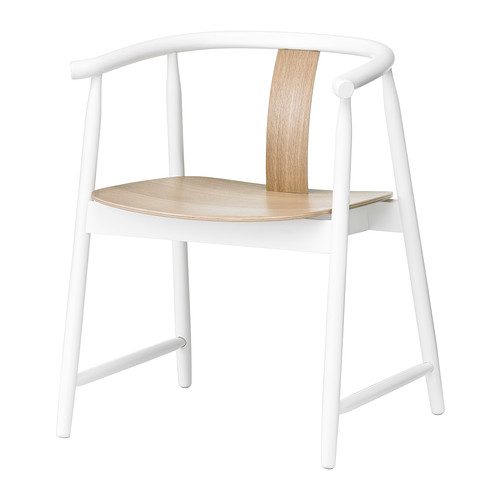
This is a new chair called the Trendig Armchair. How trendy of them. For $89 a pop this is a great way to spice up your kitchen or dining room.
IKEA1

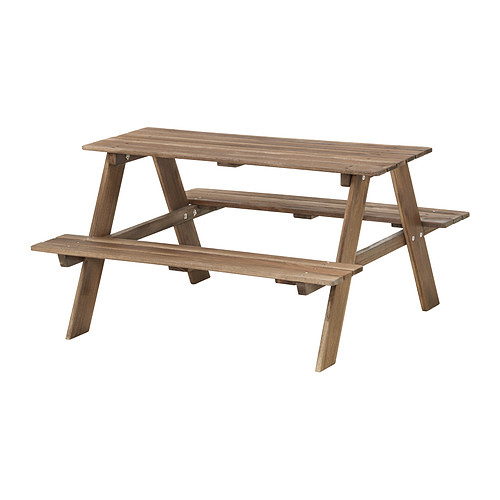
This kid's picnic table is making me long for spring, and it's only $40. IKEA2

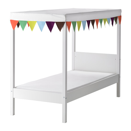
This is a children's bed called the Ovre, and it's just adorable (and only $139)
IKEA3

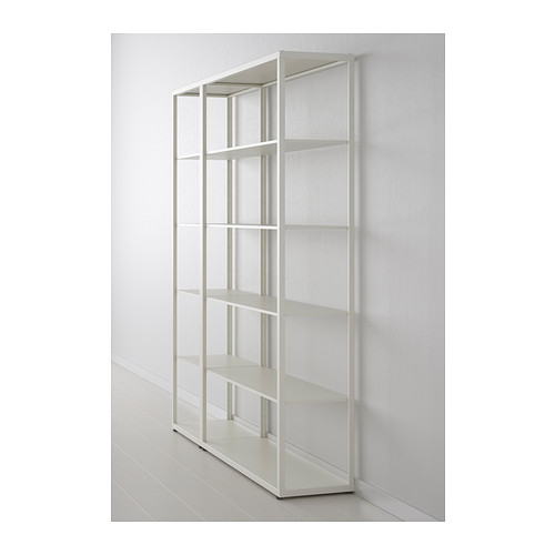
Ikea's added a new Fjalkinge (what?) to their shelf lineup for $230, and the DIY customization possibilities are endless (spray paint!)
IKEA%

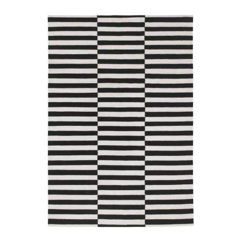
This Madeline Weinreb knockoff (called the Stockholm Rug) is nothing new, but they've lowered the price by $100 (it's now only $199). So that's exciting.
IKEA6

Has anyone else been obsessing over these Ikea finds?
->>

Wednesday, February 12, 2014

Hanging Things in 3's...

What is it about hanging things in groups of 3 that just makes sense? Perhaps it's the symmetry that 3 offer, always with a guaranteed center point. I think it's a great way to hang art, because it's hard to screw up and almost always looks good.

3 pictures in a row can help to better anchor a gallery wall.
in3s2

This set of three is on a huge expanse of wall, and fills it without making it feel cluttered.
2014-02-11 22.10.09

This grouping is taken all the way to the floor and makes the wall a little more interesting.
in3s1

BARCORNER

This isn't a straight forward grouping of threes, but by adding a center point to two pairs of prints, you can get the same effect.
2014-01-13 01.23.26

2014-01-13 01.24.06

I love this triptich from Gray Malin. How fun would this be in a kitchen or dining room?
c628ccc1ef414f24113502d5ba478030

Do you prefer hanging things in 3's? Pairs? Other? Let me know!

->>

Tuesday, February 11, 2014

New sponsor: Susty Party (and New Bar Cart/Drinking Corner/Speakeasy Situation!)

Please give a warm welcome to Susty Party.
susty

Susty Party, a company based in Brooklyn, NY, creates responsibly made, eco-friendly party supplies and compostable tableware.

Susty Party is owned by two women - Emily Doubilet and Jessica Holsey. They started the company in 2009 because the party and event industry is a huge contributor to waste. Every year, in the US alone, hundreds of billions of disposable tableware items are discarded. They saw an opportunity to make parties more sustainable, and sustainability a lot more fun!

Susty Party's tableware is compostable yet colorful, highly-functional, party-ready, and responsibly made in partnership with non-profit factories who employ and empower the visually impaired community. All Susty Party products are non-toxic, made from renewable or sustainably harvested materials, and made in North America!

They sent me some adorable straws along with some other goodies I can't wait to try out, which totally inspired a little bar makeover.
2014-02-10 02.09.00

We had the ever popular "bar cart" situation for a while, but it stopped feeling fresh.

To freshen said situation, I literally moved everything.

The space is a little odd. Eventually, we will bust that wall down, close the front part off, and make it part of my closet. But for now it's just an odd little indentation in our front hall. I've never really embraced the indentation, I've instead always tried to "fill it in." This time around, I'm choosing to embrace the space and work with the depth.
2014-02-10 02.02.26

I put a shelf we had with a shallow profile back into the space, and changed out the toy cabinet (which my husband's grandparents made him - how cute is that) for a botanical so that it laid flat against the wall.
2014-02-10 02.19.40

I filled the shelves top to bottom with all the things in our house that said "drinking". The naked lady mugs are my favorite. I stuck with silver (frames, do dads) when filling the shelves with knick knacks. It's easier to quickly make everything feel cohesive when you have a theme.
2014-02-10 02.19.50

I added a chair that I found at the consignment shop recently (you know about this if you follow me on Instagram. #sneakpeaks), and I love the pop of pink from the straws!
2014-02-10 02.20.37 

Adding the chair really helped me to embrace the depth of this space, so much so that I'll be sad to see it go once it's part of my closet. HA. Just kidding. No I won't. SHOES!
2014-02-10 02.21.49

I also like how the chair breaks up the rectangularity of the space. 
BARCORNER

Here's a good old before and after. The before picture should always be taken at crappy times of day, PS.
2014-02-10 02.02.35  


Oh, and by the way. Susty Party also has more than just straws. They have genius Party Kits. Fully compostable. How cute (and easy) are they? As if you needed another reason to host a Valentine's Day party.susty
->>